In conversation with award-winning Design Director Kaan Hiini (Te Arawa, Ngāphui, Te Rarawa, Pākehā)

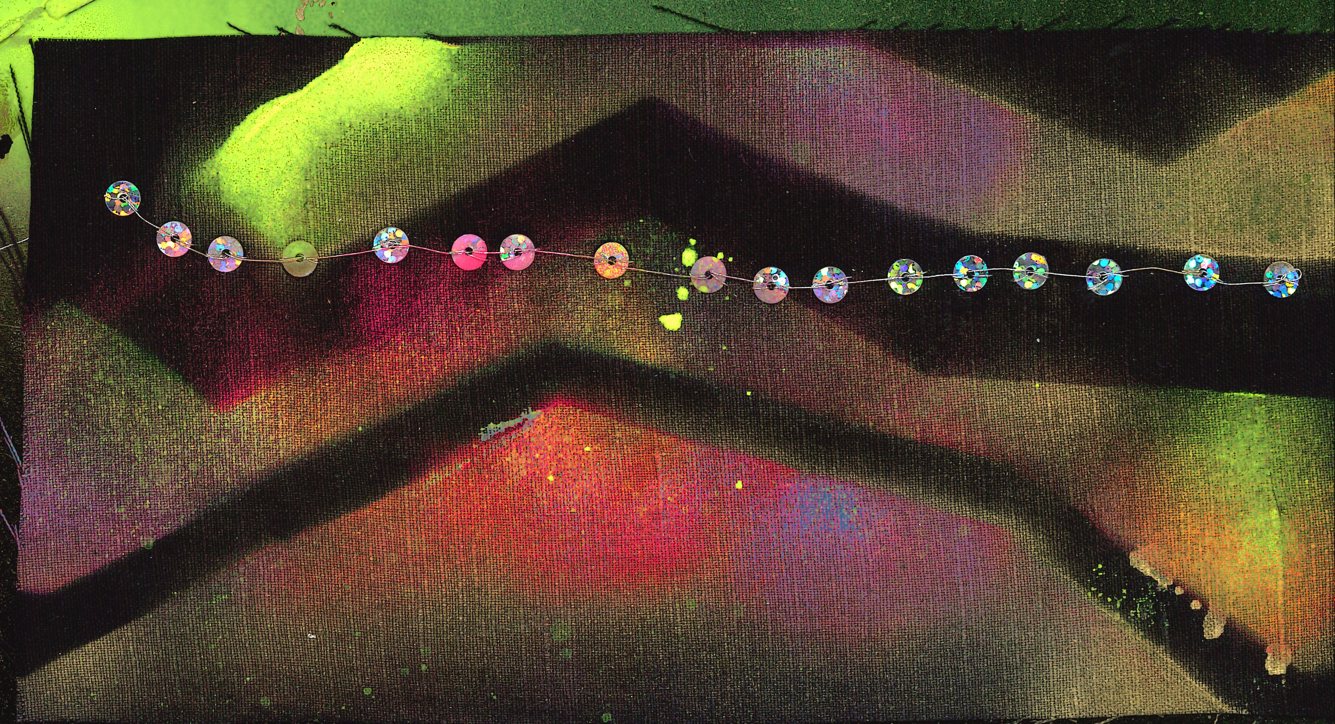
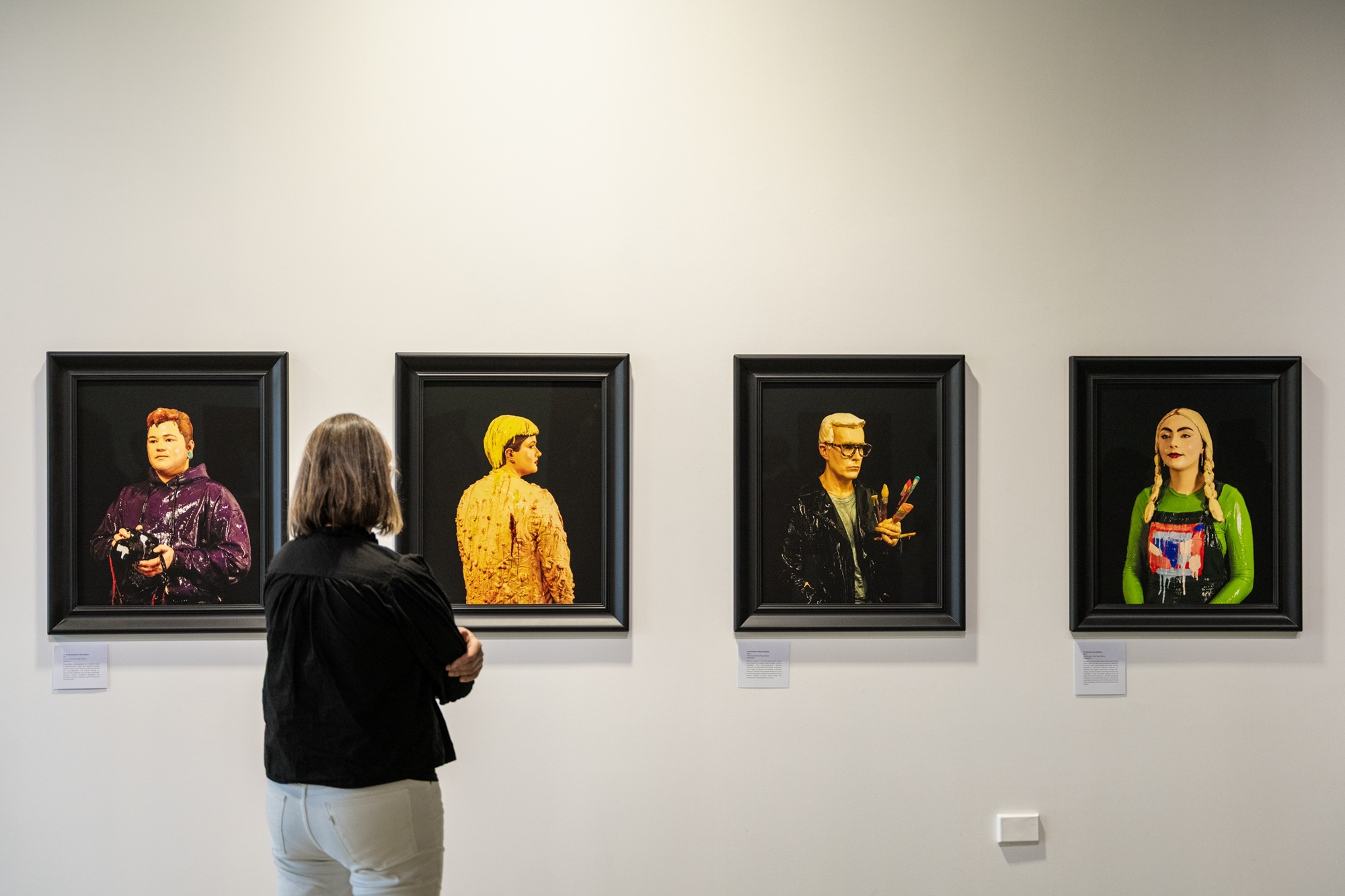
An interview with Design Director Kaan Hiini, winner of the Aotearoa Typography Poster Award 2024. His winning entry is part of the Type Here exhibition which celebrates typographic expression held at Te Atamira from 9 May 2025 - 15 June 2025.
Where did you grow up and what led you to design?
I grew up in Tāmaki Makaurau Auckland and went to AUT (Auckland University of Technology). I was going to leave high school early, then I got a scholarship to do whatever I wanted in sixth form and the creative side of design appealed to me. I was drawn to the making rather than the more formulaic thinking. Graphic design stood out to me, I think it was the problem-solving element. Having a brain that does both sides, I like to have a problem to solve, but I do that using creative thinking.
How did you come up with the winning design: Toitū te Tiriti?
I designed it as the protests against the coalition government's attacks on our founding document were being announced. The call to protect and reflect on the historic attacks on the Tiriti was the thing I felt was most relevant and urgent for the country.
What do you want people to get from it?
I want people to see it as a call to arms, and to understand that despite the attacks, we can respond as we always have when our taonga have been threatened - with collective action.
How did you came up with the idea?
I'm always interested in contemporary expressions of Māori visual culture. I love that Māori have always embraced technology. When you look at how Māori carving advanced with the introduction of metal tools, it shows how progressive and hungry for innovation we are. As I started designing the poster, I wanted to apply that approach to tukutuku panels, which are a Māori graphic and abstract visual storytelling form.
Computer design tools really increase the detail you can achieve, and geometric typeforms felt like a wonderful weaving of expression.
As I thought about the phrase, toitū te tīriti and how Māori proudly and peacefully protest, repeating that call across our history, I thought about it echoing through time and wanted to capture that feeling. I wanted to show how activism and chants can swell and fade with the circumstances of the time. I thought I could create ebbs and flow in the poster by varying distance and intensity of repetition. A simple single minded idea is often the best idea.
What the feedback’s been like so far?
Wonderful! I've had a lot of great feedback and interest in purchasing prints, so I'm organising some prints to sell - it will be a limited run, though.
What advice would you give to others entering this year’s Aotearoa Typography Poster Award?
I think the most successful entries reflect a unique approach that excites us in some way. Find something or a message that speaks to you, and think about how your output is telling that story. Type is so powerful in telling stories, and it's not just a collection of characters or letters; it's about utilising the characters and the forms to tell stories and lean into new ways of telling those stories.